
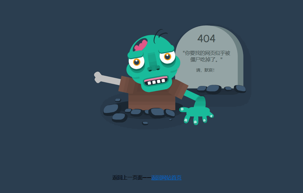
404页面是客户端在浏览网页时,服务器无法正常提供信息,或是服务器无法回应,且不知道原因所返回的页面。据说在第三次科技革命之前,互联网的形态就是一个大型的中央数据库,这个数据库就设置在404房间里面。那时候所有的请求都是由人工手动完成的,如果在数据库中没有找到请求者所需要的文件,或者由于请求者写错了文件编号,用户就会得到一个返回信息:room 404 : file not found。404错误信息通常是在目标页面被更改或移除,或客户端输入页面地址错误后显示的页面,人们也就习惯了用404作为服务器未找到文件的错误代码了。今天分享的这个 404 页面是僵尸墓碑。
预览地址
https://qiniu-mstf.sunweihu.com/%E5%83%B5%E5%B0%B8404.html
下载地址:
html 源码
<!doctype html>
<html>
<head>
<meta charset="utf-8">
<title>纯CSS僵尸</title>
<style>
html, body {
height: 100vh;
}
body {
background: #2c3e50;
font-family: 'Rye', cursive;
}
.zombie__cheeks::before, .zombie__cheeks::after {
content: '';
border-radius: 50% 0 0 50%;
box-shadow: 4px 7px 6px 1px rgba(0, 0, 0, 0.09);
background: #1abc9c;
width: 50px;
height: 50px;
}
.zombie__nose::before, .zombie__nose::after {
content: '';
width: 15px;
height: 15px;
border-radius: 50% 50% 10px 10px;
background: #07362c;
box-shadow: inset 0 8px 0 2px #148f77;
align-self: flex-end;
}
.tooth .tooth__top::before, .tooth .tooth__bottom::before {
content: '';
background: #fff;
width: 10px;
height: 10px;
display: block;
border-radius: 2px;
margin: 5px 20px 0 0;
display: inline-block;
}
.zombie__arms .left .arm__sleeve, .zombie__arms .right .arm__sleeve {
width: 50px;
height: 60px;
background: linear-gradient(to bottom, #593f35, #795548);
border-radius: 20px 20px 0 0;
}
.wrapper {
display: flex;
height: 100vh;
justify-content: center;
flex-direction: column;
align-items: center;
margin-top: 30px;
}
.zombie {
position: relative;
z-index: 1;
}
.zombie__head {
width: 150px;
height: 150px;
background: #1abc9c;
border-radius: 70% 70% 35% 35%;
display: flex;
justify-content: center;
position: relative;
z-index: 1;
animation: moveHead 5s ease-in-out infinite;
}
.zombie__head::before {
content: '';
width: 49px;
height: 22px;
border-radius: 50%;
box-shadow: 0 -2px 0 1px #1a252f;
transform: translateX(24px) rotateZ(-53deg);
position: absolute;
right: 40px;
}
.zombie__head::after {
content: '';
width: 29px;
height: 12px;
border-radius: 50%;
box-shadow: 0 -2px 0 1px #1a252f;
transform: translateX(38px) rotateZ(-13deg);
position: absolute;
top: 5px;
right: 50px;
}
.zombie__brain {
width: 30px;
height: 60px;
background: #2c3e50;
border-radius: 50%;
transform: rotateZ(55deg);
position: absolute;
top: -2px;
left: 30px;
overflow: hidden;
}
.zombie__brain::before {
content: '';
width: 30px;
height: 80px;
background: #e05887;
position: absolute;
border-radius: 50%;
left: 15px;
}
.zombie__brain::after {
content: '';
background: #e05887;
width: 15px;
height: 15px;
border-radius: 40%;
position: absolute;
top: 35px;
left: 5px;
box-shadow: -14px -8px 0 0px #e05887, -28px -10px 0 0px #e05887;
transform: rotateZ(80deg);
}
.zombie__cheeks {
width: inherit;
height: 50px;
display: flex;
justify-content: space-between;
align-self: center;
position: absolute;
left: 0;
top: 75px;
}
.zombie__cheeks::before {
margin-left: -12px;
}
.zombie__cheeks::after {
transform: rotateY(180deg);
margin-right: -12px;
}
.zombie__eyes {
width: inherit;
height: 50px;
display: flex;
justify-content: space-between;
align-self: center;
position: absolute;
left: 0;
top: 50px;
}
.zombie__eyes .eye {
background: #fff;
border-radius: 50%;
box-shadow: 0 5px 0px 1px rgba(0, 0, 0, 0.22), 0 13px 0px 0px rgba(0, 0, 0, 0.22);
width: 50px;
height: 50px;
position: relative;
}
.zombie__eyes .eye::before {
content: '';
width: 16.66667px;
height: 16.66667px;
background: #fff;
border-radius: 50%;
display: table;
margin: 20px auto;
box-shadow: inset 0 -5px 0 5px #2c3e50, 0 0 0 3px #ff9800;
}
.zombie__eyes .eye .eyebrow {
width: inherit;
height: 20px;
background: #1abc9c;
position: absolute;
border-radius: 10px;
box-shadow: 0 2px 0 1px #117964;
top: -15px;
animation: moveEyebrow 5s ease-in-out infinite;
}
.zombie__chin {
width: 100px;
height: 80px;
background: #1abc9c;
border-radius: 0 0 30% 30%;
align-self: flex-end;
position: absolute;
left: 26px;
top: 100px;
}
.zombie__nose {
width: 25px;
height: 80px;
background: linear-gradient(to top, #148f77, #1abc9c);
border-radius: 0 0 10px 10px;
display: flex;
justify-content: space-between;
position: absolute;
left: 63px;
top: 35px;
}
.zombie__nose::before {
margin-left: -8px;
}
.zombie__nose::after {
margin-right: -8px;
}
.zombie__mouth {
width: 75px;
background: #1a252f;
border-radius: 20%/10% 10% 50% 50%;
box-shadow: inset 0 6px 0 0px #e883a6, 0 0 0 4px #148f77;
align-self: flex-end;
position: absolute;
left: 38px;
bottom: -18px;
overflow: hidden;
animation: moveMouth 5s ease-in-out infinite;
}
.tooth {
width: inherit;
display: flex;
flex-wrap: wrap;
flex-direction: column;
}
.tooth .tooth__top {
position: relative;
left: 10px;
}
.tooth .tooth__top::before {
box-shadow: 15px 0px 0 0 #fff, 30px 0px 0 0 #fff, 45px 0px 0 0 #fff;
}
.tooth .tooth__bottom {
position: relative;
right: -18px;
bottom: -6px;
}
.tooth .tooth__bottom::before {
box-shadow: 15px 0px 0 0 #fff, 30px 0px 0 0 #fff;
}
.zombie__chest {
width: 150px;
height: 100px;
background: linear-gradient(to bottom, #593f35 40%, #795548);
border-radius: 20px 20px 0 0;
display: flex;
justify-content: space-between;
flex-direction: column;
position: relative;
top: -10px;
}
.zombie__arms {
display: inline-flex;
width: 100%;
}
.zombie__arms .left {
position: relative;
animation: moveLeftArm 5s ease-in-out infinite;
}
.zombie__arms .left .arm__sleeve {
transform: translateX(-25px) rotateZ(80deg);
}
.zombie__arms .left .arm__bone {
width: 100px;
height: 20px;
background: #bfbfbf;
position: absolute;
left: -100px;
top: 25px;
transform: rotateZ(-10deg);
}
.zombie__arms .left .arm__bone::before {
content: '';
background: inherit;
width: 20px;
height: 20px;
position: absolute;
left: -15px;
top: -8px;
border-radius: 40%/50% 0 30% 40%;
transform: rotateZ(40deg);
}
.zombie__arms .left .arm__bone::after {
content: '';
background: inherit;
width: 20px;
height: 20px;
position: absolute;
left: -10px;
bottom: -6px;
border-radius: 40%/50% 0 30% 40%;
transform: rotateZ(40deg);
}
.zombie__arms .right {
position: relative;
}
.zombie__arms .right .arm__sleeve {
transform: translateX(79px) rotateZ(-63deg);
}
.zombie__arms .arm__biceps {
width: 100px;
height: 20px;
position: absolute;
background: #1abc9c;
left: 95px;
top: 40px;
transform: rotateZ(25deg);
}
.zombie__arms .arm__forearm {
width: 38px;
height: 45px;
position: absolute;
background: linear-gradient(to bottom, #148f77, #1abc9c);
left: 160px;
top: 55px;
border-radius: 40%/90% 90% 0 0;
transform: skewX(-10deg);
box-shadow: -1px 0px 5px 1px rgba(0, 0, 0, 0.18);
}
.hands {
background: #1abc9c;
width: 75px;
height: 30px;
border-radius: 30%/80% 40% 40% 40%;
position: absolute;
left: 135px;
top: 90px;
animation: moveHand 5s ease-in-out infinite;
}
.hands .finger {
width: 16px;
height: 32px;
display: inline-block;
background: #1abc9c;
border-radius: 50%/80% 40% 40% 40%;
position: absolute;
}
.hands .finger::before {
content: '';
background: #fff;
opacity: .6;
width: 8.88889px;
height: 8.88889px;
position: relative;
top: 18px;
left: 2px;
border-radius: 50% 50% 0 0;
box-shadow: 0 2px 2px 1px rgba(0, 0, 0, 0.44);
display: block;
}
.hands .finger.thumb {
transform: rotateZ(90deg);
left: -15px;
top: -8px;
}
.hands .finger.index {
transform: rotateZ(20deg);
top: 20px;
left: -6px;
}
.hands .finger.middle {
top: 25px;
left: 22px;
}
.hands .finger.ring {
transform: rotateZ(-10deg) scale(0.9);
top: 20px;
left: 50px;
}
.hands .finger.pinky {
transform: rotateZ(-50deg) scale(0.8);
top: 8px;
left: 68px;
}
.ground {
position: relative;
}
.ground__hole {
width: 225px;
height: 40px;
border-radius: 50%;
background: rgba(0, 0, 0, 0.39);
box-shadow: 0 11px 34px 20px rgba(0, 0, 0, 0.25);
position: relative;
top: -42px;
}
.ground__rocks {
position: absolute;
top: 0;
z-index: 2;
}
.ground__rocks .rock {
background: #3e5871;
border-radius: 40%/80% 20% 70% 20%;
box-shadow: 3px 4px 0 5px #1a252f;
width: 40px;
height: 20px;
display: block;
position: absolute;
top: 0;
}
.ground__rocks :nth-child(2) {
left: -25px;
top: -25px;
transform: scale(1.2) rotateZ(-10deg);
z-index: -1;
}
.ground__rocks :nth-child(3) {
left: -3px;
top: -53px;
transform: scale(0.4);
}
.ground__rocks :nth-child(4) {
left: 30px;
top: -20px;
transform: scale(0.5);
}
.ground__rocks :nth-child(5) {
left: 55px;
top: -15px;
transform: scale(0.8);
}
.ground__rocks :nth-child(6) {
left: 55px;
top: -15px;
transform: scale(0.8);
}
.ground__rocks :nth-child(7) {
left: 95px;
top: -15px;
transform: scale(0.6) rotateY(180deg);
}
.ground__rocks :nth-child(8) {
left: 85px;
top: 20px;
transform: scale(0.4) rotateY(180deg);
}
.ground__rocks :nth-child(9) {
left: 165px;
top: 10px;
transform: scale(0.2);
}
.ground__rocks :nth-child(10) {
left: 125px;
top: -15px;
transform: scale(1.1) rotateY(180deg);
}
.ground__rocks :nth-child(11) {
left: 165px;
top: -12px;
transform: scale(0.8) rotateY(180deg) rotateZ(-20deg);
}
.ground__rocks :nth-child(12) {
left: 265px;
top: -90px;
transform: scale(0.7);
}
.ground__rocks :nth-child(13) {
left: 300px;
top: -90px;
transform: scale(1);
}
.ground__rocks :nth-child(14) {
left: 350px;
top: -90px;
transform: scale(0.5) rotateY(180deg);
}
.ground__rocks :nth-child(15) {
left: 390px;
top: -90px;
transform: scale(0.8) rotateY(180deg) rotateZ(-10deg);
}
.tomb {
width: 200px;
height: 200px;
background: #95a5a6;
border-radius: 50% 50% 0 0;
box-shadow: 18px 1px 0 0px #6d8082, 12px 26px 39px 7px rgba(0, 0, 0, 0.25);
position: absolute;
top: -280px;
left: 200px;
}
.tomb .tomb__info {
text-align: center;
margin: 20px;
color: #3e4a4a;
}
.tomb .tomb__info .headers {
font-weight: normal;
line-height: 1.3em;
margin: 15px 0;
}
.brains-comic-box {
font-family: 'Creepster', cursive;
font-size: 1.4em;
letter-spacing: .2em;
color: #e05887;
position: absolute;
top: -360px;
left: -200px;
transform: rotateZ(-10deg);
position: relative;
animation: moveBrainsBox 5s ease-in-out infinite;
}
.brains-comic-box .brains__text {
background: #fff;
border-radius: 40px;
padding: 15px 20px;
animation: moveBrainsText 5s ease-in-out infinite;
}
.brains-comic-box .brains__text::before {
width: 0;
height: 0;
content: '';
border-top: 1em solid #fff;
border-left: .5em solid transparent;
border-right: .5em solid transparent;
position: absolute;
bottom: -20px;
left: 160px;
transform: rotateZ(-30deg);
}
@keyframes moveLeftArm {
0%, 50%, 90%, 100% {
transform: rotateZ(22deg);
}
10%, 20%, 40% {
transform: rotateZ(0);
}
}
@keyframes moveHead {
0%, 50%, 90%, 100% {
transform: rotateZ(-10deg);
}
30% {
transform: translateX(6px) translateY(2px);
}
35% {
transform: translateX(-6px);
}
10%, 20%, 40% {
transform: rotateZ(0);
}
}
@keyframes moveMouth {
0%, 50%, 90%, 100% {
height: 20px;
transform: translateY(-10px);
}
10%, 20%, 40% {
height: 40px;
transform: translateY(0);
}
}
@keyframes moveEyebrow {
0%, 50%, 90%, 100% {
transform: translateY(8px);
}
10%, 20%, 40% {
transform: translateY(-10px);
}
}
@keyframes moveHand {
0%, 50%, 90%, 100% {
transform: translateY(0);
}
10%, 20%, 40% {
transform: translateY(-10px) rotateZ(15deg);
}
}
@keyframes moveBrainsText {
0%, 20%, 40%, 60%, 80%, 100% {
transform: translateX(20px);
}
10%, 30%, 50%, 70%, 90% {
transform: translateX(-20px);
}
}
@keyframes moveBrainsBox {
0%, 50%, 90%, 100% {
opacity: 0;
}
10%, 20%, 40% {
opacity: 1;
}
}
</style>
</head>
<body>
<div class="wrapper">
<div class="zombie">
<div class="zombie__head">
<div class="zombie__brain"></div>
<div class="zombie__cheeks"></div>
<div class="zombie__chin"></div>
<div class="zombie__eyes">
<div class="eye left">
<div class="eyebrow"></div>
</div>
<div class="eye right">
<div class="eyebrow"></div>
</div>
</div>
<div class="zombie__nose"></div>
<div class="zombie__mouth">
<div class="tooth">
<div class="tooth__top"></div>
<div class="tooth__bottom"></div>
</div>
</div>
</div>
<div class="zombie__body">
<div class="zombie__chest">
<div class="zombie__arms">
<div class="arm left">
<div class="arm__bone"></div>
<div class="arm__sleeve"></div>
</div>
<div class="arm right">
<div class="arm__details">
<div class="arm__biceps"></div>
<div class="arm__forearm"></div>
<div class="hands">
<div class="fingers">
<div class="finger thumb"></div>
<div class="finger middle"></div>
<div class="finger index"></div>
<div class="finger ring"></div>
<div class="finger pinky"></div>
</div>
</div>
</div>
<div class="arm__sleeve"></div>
</div>
</div>
</div>
</div>
</div>
<div class="ground">
<div class="ground__hole"></div>
<div class="ground__rocks">
<div class="rock"></div>
<div class="rock"></div>
<div class="rock"></div>
<div class="rock"></div>
<div class="rock"></div>
<div class="rock"></div>
<div class="rock"></div>
<div class="rock"></div>
<div class="rock"></div>
<div class="rock"></div>
<div class="rock"></div>
<div class="rock"></div>
<div class="rock"></div>
<div class="rock"></div>
<div class="rock"></div>
</div>
<div class="tomb">
<div class="tomb__info">
<h1 class="headers">404</h1>
<h4 class="headers">"你要找的网页似乎被僵尸吃掉了。"</h4>
<h5 class="headers">请,默哀!</h5>
</div>
</div>
<div class="brains-comic-box">
<h1 class="brains__text">赶快回去!</h1>
</div>
<p><a style="cursor:pointer" onclick="history.back()">返回上一页面</a>——<a href="https://www.sunweihu.com/">返回网站首页</a></p>
</div>
</div>
</body>
</html>